Brintons - 2019 Pantone Color of the Year
Pantone, the global authority on color, defines Living Coral as a warm and nourishing shade of orange.With an air of optimistic energy, Living Coral promotes human connection and pushes us to reflect on our current environmental status. In our natural world, Living Coral brings to mind ideal underwater landscapes and bountiful life-providing botanicals.
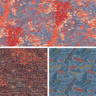
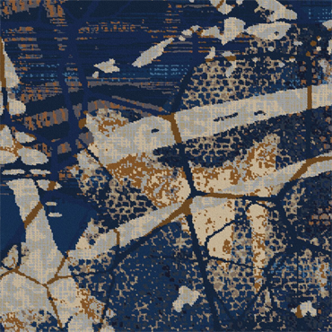
In commercial carpet, Brintons is seeing Living Coral, or Brintons Pom #25-2510 (D21), popping up in the abstract line work of loose lay Axminster rugs, used in textural layers to update traditional patterns, and smathered boldly across dynamic graphic elements. Brintons also notices Living Coral being used in multiple layers of carpet designs and in all sectors; marine, gaming, public space, and hospitality.
Hospitality interiors are seeing elements at smaller scales art objects, paintings, fabricstake on the fully saturated fill of Living Coral. In carpet, the color is typically cultivated in small percentages on the uppermost design layers allowing it to softly echo throughout the space.
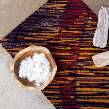
With carpet being the largest unifying element in the interior, a hue as saturated as Living Coral can quickly overpower a design and throw off the balance. However, in extremely high-traffic areas like convention centers where the energy of the color is synonymous to the energy of the space, designers may flood the floor with this saturated hue in an analogous scheme instead of only using it for highlight and contrast.
While this shade of orange can be intimidating in application, Brintons designers encourage creatives to be daring and not shy away from using bold color in flooring.
Las Vegas based designer, Sam Hoeffer, shares her insight on using her favorite pom in the box.Ive found that our #25-2510 (D21) is a popular choice amongst our Hawaiian based designers. Its especially successful when anchored in a sea of vibrant blues.
Brintons Pantone color of the year match, 25-2510 (D21), is one of over 500 standard 80% wool 20% nylon blend poms available to designers.The company also boasts one of the largest pattern archives in the industry, much of which is digitally archived and available to be customized on Design Studio Online at dso.brintons.net.
For more information on Brintons products visit our website, connect with us on LinkedIn, Facebook, Instagram, and Twitter, and follow our blog at www.brintons.net/blog.
About Brintons
Brintons Carpets is a market-leading supplier of woven carpets to the worldwide hospitality, marine, gaming, leisure, private and public sectors. Committed to the concept of thinking globally and acting locally, Brintons has design studios, offices and agents in all of the major markets around the world.
Brintons Carpets product portfolio includes premium woven axminster and wilton broadloom carpets, tiles and hand-tufted rugs.The company operates wholly owned ISO 14001-accredited facilities in India, Portugal and the United Kingdom.The company also operates a factory in Poland.
 |
Related News
Friday, April 19, 2024
ATLANTA, Apr 2, 2019 Global industry leader in luxury woven carpets, Brintons, is excited to announce its latest creative venture into Axminster carpet tiles. Nine by Brintons is a new...read more
Carpet is the foundation of the guest room. As the largest design element in the space, carpet has an important role to play in the overall interior. With a woolen Wilton carpet, woven in...read more
Expert carpet manufacturer Brintons will launch the new Craigend Collection designed by long-term collaborators Timorous Beasties at Clerkenwell Design Week 2018. Taking over St Johns Square the collection will be...read more
ATLANTA, March 15, 2017 Gone are the days of 12-foot repeats, limited colors and flat lifeless layers Brintons, a leading designer and manufacturer of woven Axminster carpet, is challenging what has been considered the standard in commercial and hospitality carpet design with...read more
Web Design
Friday, April 19, 2024

Flooring Website Design
Building Flooring Websites since 1996Zip2Biz is a perfect match for non-techies flooring retailers planning to launch their own websites, as well as for flooring dealers whose current website design is difficult to maintain, costing them too much money, or they would rather be selling flooring than dealing with a website?
learn More